Intelligent Guidance for Uncharted Roads
Chevrolet Colorado ZR2 — AR Off-Road Navigation
Designed an augmented-reality off-road guidance concept for the Chevrolet Colorado ZR2, grounded in a three-truck competitive benchmark and a survey of five off-road drivers, that GM stakeholders used mid-project to narrow their own product direction.
Role
UX Researcher & Designer
Team
One of three
Client
General Motors
Timeline
January – April 2026
Context & Problem
Four of the five off-road drivers we surveyed said the same thing: they didn’t know how difficult the trail ahead would be.
GM sponsored a semester-long capstone asking student teams to design future truck experiences that could set the brand apart from software-forward competitors entering the space. Our three-person team chose to focus on the Chevrolet Colorado ZR2, GM’s off-road performance truck.
Early competitive benchmarking made the gap concrete. Existing in-vehicle systems, GM’s included, weren’t built to support the kind of moment-to-moment decision-making off-road driving actually demands. Drivers were missing information at the exact moments when not having it mattered most.
Our question: how might we give off-road drivers real-time confidence in unfamiliar terrain, without turning the vehicle’s guidance into another decision they had to manage?
Our goals:
Ground a redesign in real off-road driver behavior and feature parity with competitors
Design an in-vehicle guidance experience that builds driver confidence without taking control away from the driver
Translate GM’s need for a differentiated, off-road-specific digital experience into a concept GM stakeholders could react to and validate

Guidance is projected onto the terrain ahead and read through the windshield, rather than on a screen in the cabin. Click or tap to enlarge.
Research & Insights
Most drivers wanted more alerts. One told us the alerts themselves were the problem.
Research design. We used three research methods, each chosen to answer a different question. A competitive analysis benchmarked the Chevrolet Colorado Trail Boss against the NIO EC6 and Rivian R1T, two EV-native competitors chosen specifically because they sit at opposite ends of a design philosophy spectrum GM needed to position itself on: tactile and physical-control-first, versus software-driven and screen-first. We structured that analysis using Dan Brown’s descriptive competitive-analysis method from Communicating Design, evaluating each truck against the same set of criteria rather than reviewing them independently (the format that makes a pattern like “tactile vs. software-first” visible in the first place, rather than three disconnected analyses).
A five-person survey of off-road and outdoor enthusiasts told us what drivers actually valued and struggled with on the trail. Secondary research across academic papers, off-road vehicle blogs, and enthusiast forums filled in what the survey alone couldn’t.
6
Trucks benchmarked
Insights. The competitive analysis surfaced a pattern worth naming directly: NIO and Rivian both used 3D and spatial visualization to reduce the cognitive load of complex vehicle systems, while the Trail Boss still leaned on nested menus and text lists for the same information, a heavier ask of a driver’s attention.
The survey sharpened that into something more specific. Nearly every respondent wanted more support navigating unfamiliar terrain: alerts about obstacles, previews of what was ahead, guidance on where to position the vehicle. But one respondent pushed back hard on the premise itself, writing that “buzzes, beeps, and warnings distract the driver” and that they preferred “minimal assistance” with full manual control.
That tension is the finding. It’s not that off-road drivers want a smarter co-pilot. It’s that the line between helpful and intrusive sits in a different place for every driver, and a system that assumes otherwise risks becoming the distraction it’s meant to prevent.
Key findings. Three findings shaped everything downstream:
No built-in trail navigation for off-grid driving. Drivers were improvising with pre-downloaded maps and prior experience, because existing systems assumed cell service and paved-road logic.
Uncertainty, not inexperience, was driving low confidence. Respondents described getting out to inspect terrain manually, following other vehicles, or turning around because they didn’t know if the truck could handle the terrain.
Drivers wanted guidance, not a co-pilot. Assistance that felt like it was making decisions for the driver, rather than informing the driver’s own decision, was treated as a liability. This became the design principle everything else answered to.
Constraints
Five survey responses, three benchmarked trucks, and a handful of scheduled minutes with GM. That’s what we had to work with.
01
Scope.This was a semester-long project sponsored by GM through UMSI.There was no contract, no budget, and no production pipeline. Our job was to hand back a research-informed concept GM could react to. The constraints below (small sample, limited stakeholder access, no usability testing) follow directly from that structure.
02
Sample. Our survey sample skewed toward people already comfortable identifying as off-road or outdoor enthusiasts, rather than the fuller range of ZR2 buyers GM itself segments, from work-focused trims to first-time off-road lifestyle buyers. Five responses point us in a direction, but they're not enough data points to validate a proposed feature set.
03
Stakeholder access. GM stakeholder access was structured around fixed check-in slots at set points in the semester rather than ongoing collaboration. That meant when feedback did arrive, it carried heavy weight. A single check-in redirected our scope from a broad platform redesign toward a focused concept, with a narrow window to absorb that redirection before the next milestone.
04
Validation. We also didn’t run formal usability testing on the AR concept within the course timeline. What we have is a research-grounded design direction and a working interactive prototype, not validated interaction data. Usability testing would be the next step if this concept moved forward.
05
NDA. This project is also NDA-bound with GM. GM’s specific brief language, internal figures, and individual stakeholder identities aren’t reproduced here; feedback and direction throughout this case study are described as coming from GM stakeholders and mentors involved in the program.
Process & Key Decisions
Three decisions came out of that pivot: navigation guidance, obstacle alerts, and tire-placement guidance.
Our early assignments benchmarked the Trail Boss as a standalone platform redesign: screen sizing, content blocking, a full competitive teardown. It was a GM stakeholder check-in partway through the semester that narrowed our scope. Rather than a broad interface overhaul, we were asked to focus specifically on the AR windshield display and return with a small number of concrete solutions. That redirection is the reason the final concept centers on three AR-driven decisions instead of a full platform redesign, a decision that ended up streamlining the work considerably.
I owned the platform’s interaction design (the AR Guidance UI specifically, the driver display layout, and the overall screen system), while a teammate led the AR flow logic and gauge design, and our third teammate built the truck visualization used throughout the prototype.
Navigation guidance. Jane, our primary persona (a technical off-roader based in Irvine, California) pre-downloads trail maps before heading out, since cell service off-grid is unreliable. The truck’s Off-Roading Maps experience is a deliberate handoff from the on-road Google Maps interaction she already knows, rather than a pattern she has to learn from scratch. This follows Jakob’s Law, from Jon Yablonski’s Laws of UX: users transfer expectations from familiar products, so the mode change needed to feel like exactly that, a mode change, not a new app.

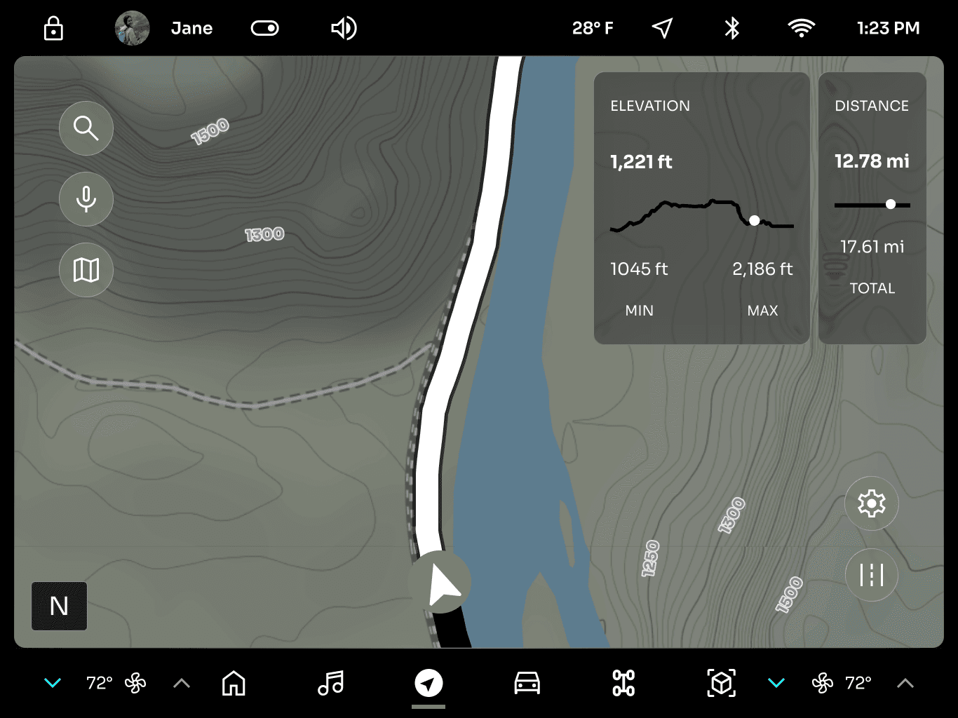
The trailhead is flagged on the on-road map with the switch offered in place, so moving to off-road mapping is a mode change the driver accepts rather than an app they have to go and find.

A green path marks the route across the terrain, so the trail stays visible without a glance down at the map.
Obstacle alerts. When Jane reaches technically difficult terrain, the system flags hazards (low clearance points, water crossings, uneven ground) visually on the windshield and audibly, rather than requiring her to look down at a center screen. This is where the “guidance, not co-pilot” finding did the most work, and where that one dissenting survey response mattered most: the system surfaces risk, but Jane decides how to respond.


Hazards ahead are outlined on the windshield, with a speed bar showing the pace the terrain will take.
Tire-placement guidance. An AR preview shows Jane where her tires will land relative to obstacles ahead, the same kind of support a passenger calling out a line would give, made available when she’s driving solo. This decision came directly out of a specific piece of research: the reasoning that surfacing why a system is flagging something builds more appropriate trust than a bare alert does. A tire preview doesn’t just say “obstacle ahead,” it shows the driver what that obstacle means for their actual line through it.
The tire preview projects where the wheels will land relative to the obstacles ahead, the line a passenger would otherwise call out.
Each AR layer is a toggle on the center display — trail path, tire preview, speed bar, obstacle alerts — so the driver sets how much the windshield shows.
2 seconds
NHTSA’s threshold for eyes off the road
Outcome & Impact
The concept GM reacted to was the same one a driver had described unprompted in our own survey: an “ideal path” shown to them on the trail.
We delivered a working interactive prototype covering the full off-road scenario (trip planning, the on-road-to-off-road mode transition, AR-assisted driving through technical terrain, and a resting-page experience at the destination), along with a driver display cluster and a presentation to GM stakeholders walking through the research and design rationale.
Revisiting our original goals:
Ground the redesign in real driver behavior. The competitive analysis and five-person survey directly shaped which features made the final cut. The AR concept exists because “guidance, not co-pilot” came out of driver research.
Design guidance without taking control away. Every AR feature we shipped informs a driving decision rather than automating one: path marking, not autopilot; obstacle alerts, not automatic braking; tire preview, not lane assist.
Translate GM’s need into something reactable. The scope narrowed specifically because our GM stakeholders could react to a focused AR concept in a way they couldn’t react to an open-ended platform redesign. The check-in that redirected our work is itself evidence the concept did what it needed to do.
There’s no shipped-product metric to point to here.But one line from our own survey data says more than a metric could. Before we’d designed a single AR screen, one respondent described what they wanted from an ideal adventure vehicle:
“I like the idea of local trail/camping suggestions! Also think a more detailed view of some off-road trails would be cool to show an ideal path for the driver.”
That’s the tire-placement and path-guidance concept, described by a driver who’d never seen it.
Trip planning
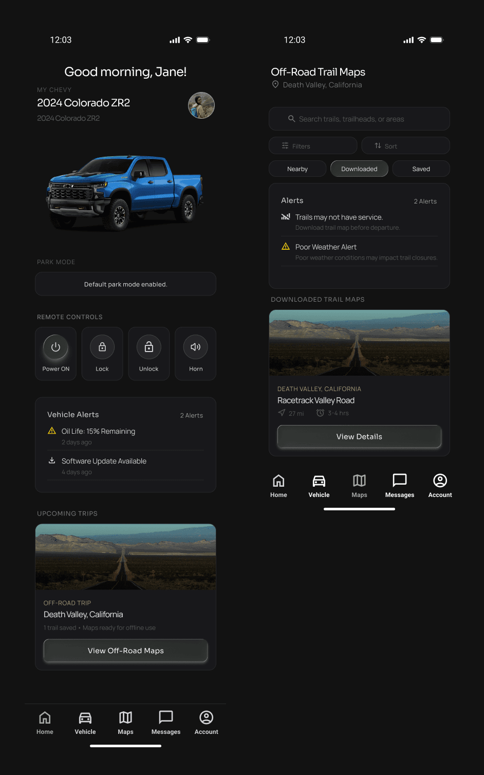
Trail selection

Planning happens before the truck moves — trails downloaded against a route with no cell service, then checked against the vehicle itself: clearance, 4WD support, and the drive mode to engage before departure.
Off-road settings
Maps and widgets

The prototype covered more than the windshield: drive modes and ride height for the terrain, a camp mode for when the truck is parked, and the on-road map and widgets.
Driver display

The cluster carries what the terrain demands — heading, elevation, drive mode, and a rear camera view — so the windshield and the center display aren’t the only places to look.
Reflection
GM’s mid-semester check-in told us two things: narrow to three AR features, and stop refining a truck illustration that was already further along than it needed to be.
The second piece of feedback landed harder than the first. By our high-fidelity check-in, the truck visualization was fully realized: illustrated, styled, further developed than that stage of the project called for. GM’s note wasn’t that the drawing needed fixing. It was that it hadn’t needed to be that finished yet.
We didn’t rework it, since the work itself was already done, but it changed where the team put its attention for the rest of the project: less time on visual polish for the truck, more time on the AR interaction decisions GM actually needed to react to. That shift reshaped priorities across the whole team, not just for the teammate who owned the truck visualization, and it’s part of why the final concept centers on three AR-driven decisions instead of a broader platform redesign.
Off-road driving is a live, physical decision problem under uncertainty: reading terrain, managing real risk, deciding how much to trust an unfamiliar system when the stakes are physical, not just informational. Designing an interface that informs rather than overrides mapped onto something more basic than a UX guideline: how people regulate trust and attention under real consequences.
The survey respondent who rejected extra alerts entirely was proof of that same principle. Assistance only works if it respects how much control a person needs to feel like they still have it.
The bigger lesson was about project planning, not about the illustration itself. We invested in visual fidelity well past what the checkpoint actually required, before the AR interaction concept (the part of the work GM most needed to react to) had gone through a single round of stakeholder feedback. If I did this again, I’d hold visual polish back until the underlying concept had been validated.
I’d also want to validate the AR concept with actual off-road drivers. Five survey responses told us what people wanted. They didn’t tell us whether the system we designed would actually earn their trust on a real trail.